1. My expectations of this course were to learn a little bit of the history of art while also learning different techniques, concepts, and styles. My expectations were definitely met because the terminologies learned were not so complex and were basic enough to understand.
2. In the beginning, I said that art is any form of expression. Now, I'd say it's any concept, thought, or work that has structured forms, elements, and principles.
3. I still feel strongly about Frida Cahlo being my favorite artist because not only do I admire her work, her life story influences her works and her works tell her story.
4. I still enjoy taking on-line classes much more than physically sitting in a classroom. I have better time management and can self-teach myself.
Thursday, May 14, 2015
Saturday, May 9, 2015
Art & Science
The theme and title of my exhibit is called "Art & Science". For many years, my father and I have had several discussions of the topic: do art and science go hand in hand? I always though that art had nothing to do with science at all. As time went on, my best friend opened her new beauty salon and called it "Art and Chemistry". I asked her why she chose that name and why did she incorporate chemistry into it? She responded, "if it weren't for the mixing of chemicals to create hair products, I wouldn't be able to make the intense colors I apply to hair to create my artwork. Her form of expression is through hair, and without science, she wouldn't know which chemicals created what colors. I began to ask myself. Can science be an art form? As I researched several science related topics, I noticed that several artist, like Leonardo DaVinci, were also scientist! This were the inspiration for my exhibit was born.
Saturday, May 2, 2015
Pop Art & Tate Modern
In the first video, they talk about the concept of Lowbrow and how several artists feel about it. Artists define lowbrow as a genre of art in which anything popular in society is transpired in their paintings. others like art historians would define it as pop surrealism; however, there isn't too much surrealistic features about it. It is almost like life around us in cartoon form. In my art exhibition project, the artist I studied practiced this movement a little bit by exaggerating features of certain pop artists. Therefore, pop culture is expressed through this medium of art.
In the second video, we learn about what is Tate Modern. Tate Modern is a modern art gallery located in London. Their exhibitions presents different elements of pop culture, abstract architecture, and contemporary art. One of the rooms is built to create the optical illusion of you getting taller while the room is "getting smaller". The way the museum is set up helps the audience feel like they are a part of the art while learning hands-on about the art.
I enjoyed both films for different reasons. One, I learned that my dad and I fall under the lowbrow movement of art. Our style of art definitely has a lot of elements of pop culture in it whether through cartoon characters or musicians. The second video gave me a better understanding as to why the environment of the museum is so important for audiences to enjoy their visit. It definitely makes a lot more sense to make it a fun environment where you can physically be a part of it as opposed to just walking around and looking at paintings.
Saturday, April 18, 2015
Expressionism vs. Cubism
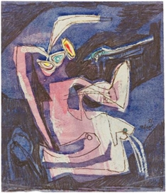
I chose these two videos because I like to learn about the different styles of art rather than about the artists themselves. I wanted to learn about how each movement changed people's ideas and thoughts on artwork. In the video of expressionism, I learned that artists emphasized mainly on color to express emotional properties of humans and environment. Also, lines gave off several emotions depending on how they were being used. For instance, in the portrait "Ashes" the wavy hair on the woman's head made her look like a predator, almost like Medusa. In the video of cubism, I learned that Pablo Picasso and George Braque were among the first creators of the movement. Cubistic artist used lines and shapes in an abstract format to create human characteristics in a non-human form. In the text, they also describe how Picasso began this movement and how critics felt about this movement and style.
Burchfield Penney Art Center
During my recent visit to the Burchfield Penney Art Center, I was super excited of seeing Philip Burke's exhibition. The theme of his exhibit was called "The Likeness of Being" was based on a play on Milan Kundera’s novel The Unbearable Lightness of Being. According to the artist, it is about the deeper aspect or the spiritual aspect of what he was trying to do.
As you was around the East Gallery of the center, you noticed the edgy, white walls where the artworks were mounted about 6-8 inches apart in a perfect alignment. The hardwood flooring gave warmth to the bright, white room, and the edgy walls popped out making you turn at every corner to find more brilliant works. There was a specific part where the room became circular and gave space to the environment. All of the works were on canvas, and they were labeled with his signature and date of creation.
For the most part, each work was similar in the aspect of how it was presented, and the media used. His use of caricature and abstract expression was exhibited through every portrait. However, each one illustrated a different person in our pop culture and how their personalities are shown through their physical features. Here are my top three favorites by Philip Burke:
Philip Burke. Joey Ramone; oil on canvas, 36 x 48 inches
I love the Ramones, so this was definitely a bias critic. First of all, the lines and colors totally capture Joey's punk rock edgy personality and high spirit. The shapes of his eyes, nose, and lips are completely non-realistic and exaggerated.
Philip Burke, Neil Young; oil on canvas, 48 x 60 inches
Neil Young was an interesting celebrity to capture; his rough and aged face his definitely portrayed in this painting. The timeless musical legend holding his guitar in all these vibrant colors shows the power of his music.
Philip Burke. George W. Bush; oil on canvas, 36x36 inches
First of all, the fact that Burke painted Bush with his mouth open is enough of an analysis of Bush's personality. The red background symbolizing the urgency or power Bush portrayed is enough to know he is interpreting all of his political aspects through physical queues. Making the head bigger than the usual proportions definitely symbolizes the high-power of his political term.
In this project, the biggest part about it was analyzing the environment rather than the artwork itself. It was definitely an unusual experience in the sense that I don't normally walk into an art gallery to check out the architecture and schematics of the room while there is a ton of beautiful works of art surrounding me. It defeats the purpose of appreciating the artists' works when you're admiring the hardwood floors or light fixtures on the ceiling. Sure the environment plays a role on how you perceive the artwork; however, in my opinion, it's not something I detail on a regular basis.
Thursday, April 9, 2015
Mask Making


When creating my sketch, I thought of different elements that represented who I was. First, I created the diamond shapes for my eyes to represent the glory I see in life. The circles around the eyes gave depth to the eyes. The lines and dots not only showed where the eyebrows are, but it gave rhythm to the mask's symmetrical design. the shading under the eyes made the "cheek bones" pop out, as well as the dark shadings on the sides. The flowers symbolized my peppy outlook and personality.

And vuola! This is the final piece. The colors I chose are a mixture of strong, vibrant colors and neutral. The neutrals symbolize my independence from single-minded options. The pink flower on the forehead swirls clockwise representing time. The orange flower... well I LOVE orange so I had to add a little bit of me to it. It was pretty awesome making this mask, and it was only made with recycled cardboard! I can't wait to make one a little bit more sturdy for a masquerade party!
Saturday, April 4, 2015
Exploring Lines

In my experience, I am terrible at drawing hands! Every time I had to draw a person I would either draw them hiding their hands or hand-less. This project really made me focus on the small details on my hands. I was so fascinated with the tiniest lines in each wrinkle or print that I couldn't even begin to duplicate it on paper.
I decided to use pencil not only because it is easier to control with both hands, but because if I made a mistake I could easily erase it. Drawing with my non-dominant hand (my left hand) was the funniest and most intense task I've had to due in a while. Even after all the concentration that went into it, the drawing came out terrible. Multitasking was not an option at all. The smallest things threw me off and I'd have to erase and start over.
Looking at the two hands, the results of my studies are simple: I am not ambidextrous! Drawing with my right hand, or my dominant hand, was effortless and I could do and think about more than one thing. I could even focus on smaller details that we take advantage of on a daily basis. drawing with my non-dominant hand, however, made me focus on just the general picture and making sure that it just looked human-like. I would definitely consider practicing painting with my non-dominant hand in the future to create an abstract, or non-realistic, image.
Thursday, April 2, 2015
El Greco and Velazquez
There are two key reasons for me choosing the following artists: El Greco and Velazquez. One, these are two artists I was not familiar with and wanted to study them more. Two, the minute I found out their styles were to paint Spanish artworks, I was thrilled! I love Spanish and European Renaissance art. It's elegance and poise truly shows how there was a huge enlightenment in that time era.
Velazquez, according to the video, was a very well educated artist who did things at his own leisure. It would take him years to complete one paining, and he much rather have painted reality than mythology. El Greco was highly popular in Spain for his paintings that were religious in nature. His works from this period are seen as precursors of both Expressionism and Cubism. Both artists, being from the renaissance era, were very interested in observing the natural world and painting it as accurate as possible. Their religious symbolism stemmed from the Byzantine style.
These videos were small but detailed examples of artists in this time period and what inspired them to paint their works. The imagery definitely gives you a feel of how all these artists blossomed from the enlightenment. Both artists bloomed during a time when King Phillip III was in power, and they depicted life in that point in time.
Saturday, March 21, 2015
More Human Than Human & The Measure of All Things
In the Video "More Human Than Human", we learn the reasoning behind why humans are so obsessed with the human body in art. Also, we learned why we are so in awe when we see the human body in distortion. One theory explained by the video was how societies view structure. For example, the Egyptians run in an organized and strict society. If you look at all the Egyptians' drawings of the human body, they are all almost identical in form. This is because each form of the human body fits a distinct grid patter that align perfectly. Also, the images are distorted because they emphasize the important parts of the human body in the most important angles. Here is an example of the grip system they use to draw out the human form:
Another idea they came up with is how many humans exaggerate the most important parts of the human body they think are the most important or the most significant to that person. For instance, if there is a sculpture or drawing of a person, and the head is ten times bigger than the rest of the body, this might be a representation of how the artist felt the brain was the most important part of the body. This video gave depth to the textbook about the workings of the minds of humans when creating these images of the human body.
I chose the video "The Measure of All Things: Greek Art and the Human Figure" because Greek art, science, and philosophy has always intrigued me. Their logical way of thinking is simple and pure. In this video, they are explaining how Ancient Greeks were trying to deviate from the Egyptians two dimensional human view and started moving towards art that is three dimensional, and more human like. They incorporate all human features and emotions into the sculptor to make them look almost life-like. Both these videos were truly helpful in understanding why so many artists have adopted the idea to create the human body through art in their own distinct ways.
Saturday, March 14, 2015
Video Review
I chose the video "Prairie Style" because I have actually visited one of the Frank Lloyd houses before and wanted to learn more about his general thought process during the creations of all his architectural plans. Towards the end of December 2014, I visited the Martin house complex right here in Buffalo, NY. Here is a picture of my fiance, godparents, and I in front of the complex:

A few key points I learned in this video was that his main focus when planning these houses was to make everything horizontal. The horizontal construct was to purposely make us look around and take in all the natural elements made in our surroundings. This video helps give substance to the article on page 305 on Frank Lloyd Wright and not only explain how he created the houses but showed images of the houses to give viewers an idea of what it meant to build horizontally. Wright helped many other architects get out of that single-minded way of building box-like houses and add more open space for natural light.
I also chose to watch the video "Last Call For Planet Earth." This video was all about sustainable development and the awareness of our planet's global warming problems. They talked about how us as humans seem to forget that this planet does not have eternal supply and we are very limited on resources; however, we consume double the amount we should and don't giveback to our planet. Architects are finding several ways of using renewable resources and energy when creating their structures. I chose this video because I recently read the story "The Lorax" to my pre-k children and it reminded me of the morals and values we should be teaching our younger generations about taking care of our planet while evolving and finding new ways of inventing without leaving a huge footprint in our planet.
Thursday, March 5, 2015
Blog Peer Reviewing
For this assignment, I reviewed the following classmates:
1. http://creativesoul87.blogspot.com/
2. http://ckasprzak.blogspot.com/
- In project #1, there were several principals and elements I admired. However, I was a little conflicted with one. One of my classmates used a picture of an orchard to portray the element of value. I believe that it was a great way to show all the different shades of purple the flower contained; however, I thought the element of value meant you were using only the gray scale. If I am wrong, someone please correct me!
-In project #2, "Fear of the Night" seemed to be a common selection for several different reasons. I selected it because I wanted to know the reasoning behind this work, whereas my classmates seemed to have some sort of connection with it.
- "Body and Soul" was an artwork that at first glance was strong to the eyes. Now that I saw it again on the blog, I became very interested as to the title selection for the work. I would like to understand what it means and how the artist had a connection with it.
- Reading my peers reflections makes me realize how different ones perspective can be from another. For one person, a work can have a personal connection that brings back a memory, whereas for another they feel a huge impact on it, whether negative or positive.
-So far I have not seen any comments from my peers on my blog. However, I take very well to constructive criticism and feel that I would learn more from their opinions than from believing I did my best.
Sunday, March 1, 2015
Albright Knox Museum
During my trip to Albright Knox Museum in Buffalo, there were many works of art that spoke to me. Here are the selections I made of works I really enjoyed looking at the most:

Ben Shahn. "Spring" 1947. Tempera on Masonite (Room of Contemporary At Fund, 1948) I feel like I had a spiritual connection with this work of art for two reasons. One , I felt a sense of love and warmth when I looked at this painting, and it reminded me of the love and warmth i felt when I first met my fiance. Two, it depicted a wonderful image of a warm spring day at the park, and had a depth to it that made you feel like you were in the artwork.

Piet Mondrian. "Composition No. 11" 1940-42, LONDON, with Blue, Red and Yellow, 1940-42. Oil on Canvas (Room of Contemporary Art Fund, 1944). This artwork made me feel a connection because this painting looks extremely similar to a painting my dad once made when I was little. He was taking art classes and painted an oil on canvas work just like this one.

Man Ray. "Symphony Orchestra" 1916. Oil on Canvas (George B. and Jerry R. Mathews Fund, 1970). This work definitely impressed me in the sense that it truly depicted what it would look like if we could see the music we here from an orchestra. There's a plethora of colors that bring out the vibes of the orchestra, and some shapes representing the different instruments.

Norman Wilfred Lewis. "Street Music" 1950. Oil on Canvas (Bequest of Arthur B. Michael, by exchange, 2009). This piece impacted me greatly because of the way the artist illustrated a genre of music. He definitely showed the tough and eccentric energy of street music, and how this type of music doesn't really have a flow, rather than improvised instrumentals.

Ben Shahn. "Spring" 1947. Tempera on Masonite (Room of Contemporary At Fund, 1948) I feel like I had a spiritual connection with this work of art for two reasons. One , I felt a sense of love and warmth when I looked at this painting, and it reminded me of the love and warmth i felt when I first met my fiance. Two, it depicted a wonderful image of a warm spring day at the park, and had a depth to it that made you feel like you were in the artwork.
Piet Mondrian. "Composition No. 11" 1940-42, LONDON, with Blue, Red and Yellow, 1940-42. Oil on Canvas (Room of Contemporary Art Fund, 1944). This artwork made me feel a connection because this painting looks extremely similar to a painting my dad once made when I was little. He was taking art classes and painted an oil on canvas work just like this one.
Man Ray. "Symphony Orchestra" 1916. Oil on Canvas (George B. and Jerry R. Mathews Fund, 1970). This work definitely impressed me in the sense that it truly depicted what it would look like if we could see the music we here from an orchestra. There's a plethora of colors that bring out the vibes of the orchestra, and some shapes representing the different instruments.
Norman Wilfred Lewis. "Street Music" 1950. Oil on Canvas (Bequest of Arthur B. Michael, by exchange, 2009). This piece impacted me greatly because of the way the artist illustrated a genre of music. He definitely showed the tough and eccentric energy of street music, and how this type of music doesn't really have a flow, rather than improvised instrumentals.
Jean Metzinger, 1912, "Danseuse au café, Dancer in a café", oil on canvas, 146.1 x 114.3 cm. I truly admired this piece when I first glanced at it. it had so much shapes and lines and truly had so much noise in it it truly seemed like I was watching a dance and hearing the music. I would love to know more about the artist and what he was trying to convey in this artwork.
Afro "Fear of The Night" Gouache and water color on paper. 10.25 X 8.62 in (26.04 X 21.89 cm). This artwork screamed fear and the way we feel when we are afraid. I truly feel this way sometimes when I'm in the dark all alone. I would like to know if the artist has a phobia of the dark and if this is his way of expressing it.
Saturday, February 28, 2015
Logo Design


During this logo creation, a lot of thought was put into place before even starting the sketch. I thought of events and obstacles occurring in my life at the moment and how these things represent who I am or how I want to be seen. Between my upcoming marriage, working toward my degree, my currently challenging job, and my house seeking project, it would seem as if I'm on the verge of insanity. However, thanks to my wonderful fiance, I've managed to keep my cool and continue jumping hoops with ease. We are spiritualists, and two people who admire the nature around us. So I decided to draw our favorite tree with a moonlight sky in the background to resemble my calm nature during dark moments. It was truly an interesting way of promoting my personality and makes me realize how businesses and other organizations create their logos. The most important discovery I made about creating my logo was the colors I chose. Since I chose dark blue and light green, it captured that element of spirituality. If I would of picked yellows and oranges, it would've given off stronger energies and wouldn't have captured the night sky. The most important information i captured from all of the resources given during this module was that it is crucial to understand and know what is the key message you are trying to convey with your logo. You want to make sure the meanings behind certain patterns truly match your advertisement.
Saturday, February 21, 2015
The Color Wheel
When I began to create the value scale, I started with the darkest box and went lighter and lighter. I feel if I would've done it the other way around it would've been a lot easier to do. When I began to do the color wheel, I felt like it wasn't going to work because of the magenta and the cyan. I was so use to the idea of my primaries being red, yellow, and blue that this new idea seemed almost impossible. However, after watching the video first, it was clearer to me now of how red and blue could be considered a secondary color. It was so interesting mixing the colors and watching them change.
I enjoyed working with the paint more than with the pencil shading because it gave me pleasure to have so many colors to work with. Something I noticed that was very important was how the balances of the primaries had to be just right to get the desired shade. Too much of one shade could change the color, whether in a lighter or darker tone. When I watched the video, I learned that if you mix red and blue it makes an awkward shade of purple, and if you mix red, blue, and yellow, it didn't really turn black; it looked more like a dark shade of brown. Not that I have all these colors accessible, I think I'm gonna go do some painting!


I enjoyed working with the paint more than with the pencil shading because it gave me pleasure to have so many colors to work with. Something I noticed that was very important was how the balances of the primaries had to be just right to get the desired shade. Too much of one shade could change the color, whether in a lighter or darker tone. When I watched the video, I learned that if you mix red and blue it makes an awkward shade of purple, and if you mix red, blue, and yellow, it didn't really turn black; it looked more like a dark shade of brown. Not that I have all these colors accessible, I think I'm gonna go do some painting!
Sunday, February 15, 2015
Elements and Principles Slideshow
http://s304.photobucket.com/user/Suki_Corchete/slideshow/Elements%20and%20Principles%20of%20Art%20and%20Design
For this project, I faced many new experiences and many obstacles. Before, when I use to take a picture, it was only to capture a memory or to complete a photo shoot for my job. Now, when I point the camera at my target, I will definitely appreciate all the elements and principles that come with it. I'm going to admit, some of these pictures are not so recent due to the terrible weather we have had the past few weeks. However, some of these pictures are from this past fall and were all taken by me and my fiance. I own a Nikon D3000 pro digital camera and take advantage of every moment I have to take awesome pictures of scenery and other events.
When taking pictures at Allegany National Park, I ventured into many parts of the forest to capture the perfect angles, lighting, and of course, to admire the nature that surrounded me. As I viewed the pictures I chose, I realized that it wasn't me creating these elements, it was natural light, color, lines, and space that created the image. These elements made nature speak for itself; it gave nature a voice.
Okay, so Delaware Park was the perfect location to capture more elements. The "Live Buffalo" picture had three elements: color, texture, and pattern. It was a true patriotic and vibrant photo that represented the area for what it truly stands (even though right now everyone is dreading Buffalo for its arctic weather).
I took advantage of my recent mini trip to Florida last weekend to take some more pictures. For balance and rhythm, I could not help but to manipulate certain aspects to represent each principle. Balancing the sword on my head was the perfect literal explanation of balance in a photo. My footsteps on the sand showed rhythm by illustrating a repetitive motion. And there was no better way to represent scale and proportion than to build a snowman this weekend with my lovely partner in crime and stand right next to it! (Okay, there probably is a better way, but this way was the funnest!)
From this point on, I feel it crucial to take all these elements and principles into consideration. Planning before taking the shot makes you realize what are your main focuses. And don't forget, sometimes these elements are given to us straight from mother nature.
Saturday, February 14, 2015
Colors & Their Effect on Emotions
Color is a function of light, Without light, we would not be able to see color. The color theory started with an experiment created by Sir Isaac Newton. He passed a ray of sunlight into a prism and saw that when light refracted, a "rainbow" of colors came out the other end. Colors absorb most of the light from its surrounding and reflects visual color to our eyes. For instance, when red and yellow absorb light, it reflects the color blue. What mot fascinates me about this action is that even though one color is absorbing light, it reflects a completely different color. Instead of yellow reflecting yellow, it reflects purple when it absorbs light. Another intriguing aspect of color is that our eyes are so dependent on color, we use color to determine what kind of foods we eat! In our textbook, it talks about a study where scientists colored mashed potatoes with green food coloring, and several people could not identify what they were eating. To see for yourself, watch this video from ASAP Science on "The Science Taste Challenge" https://www.youtube.com/watch?v=SXtg-9Q6Iew. Not only is it hilarious and entertaining, you learn how important our sense of sight is when eating or drinking.
When we look at a color, we don't just think it's "pretty" or "ugly", we feel a certain emotion just from looking at the color. Our emotional responses to color are so strong, we fail to realize that these responses to color are both culturally conditioned and intensely personal. Americans, for example, look at the colors red and green and automatically associate it with Christmas. For some, like German painter Franz Marc, blue is a color of spirituality. I think we as a society can all agree blue is a pretty peaceful color. However, why do so many people say they have "the blues" when they are sad? It is all how one perceives the color and the personal connections to it. For many, orange may be considered a very powerful color that gives energy, and may not want to be surrounded by the color during a meditation process. I, on the other hand, have a very strong connection with the color orange and can be surrounded by the color any day at anytime. This is due to an emotional attachment to the color from my favorite toy growing up.
In the video of "color", one of the key points I caught on to was how lighting affected color, also affecting how one feels about the color. When artist June Redfern sketched her canvases in Venice, she was satisfied with how they turned out and how beautiful the colors reflected off the Venetian light. Once she went back home and placed the canvas sketches in her studio, she was not pleased with the results. She stated that "it must have been the lighting." In the video "Emotions and Art", 18th century painters David and Goya depict our feelings toward God and human emotions through their art. The biggest impact this video made on me was how these two artist brought reasoning and logic to religious art in a time where religion and God was the reason why. In medieval times, people suffered poverty and disease because of sin and because that was what God chose for you. David and Goya, through their art, say "no, no, no, we suffer from poverty and disease because of human behaviors, decision, and nature. We feel suffering not because God makes you feel it, but because you as a human feel these emotions from your actions. It really is a radical battle against Biblical ideology.
Saturday, February 7, 2015
Art Aesthetics
For the first video, one of the major key concepts discussed was the beauty of art. They talked about what made art beautiful and the difference between what we consider to be art and everything else in the world. Also, they discussed how art and beauty are two separate things. For example, Picasso's Guerneca was definitely considered art; however, it was not thought about as beautiful. The judgement of beauty is based on a feeling, not a rule.
Video number two talks about the evolution of art and human's depiction of art from the Homo habilis stage to present day. Also, it brought up points on how art and science interconnect with one another. The key was how does art interfere with the human brain and emotions? The article briefly illustrates all these concepts mentioned and summarizes how we react to art and why certain images give off certain emotions.
I believe that Kant's theory is important because many people strongly believe that beauty is one certain concept and that everyone thinks the same way about beauty. His theory suggests that beauty is not a rule or concept, rather than a feeling toward a person, place, or object. For instance if I look at a picture of a snake, I would say it's beautiful because I like snakes and don't feel anything negative towards it. However, someone who is deathly afraid of snakes may look at the same picture and say it's grotesque or hideous.
Ramachandran proposed that the brain reacts to certain forms of art, not in a realistic matter, but understanding that even though it isn't real it still gives off a certain reaction whether it's religious based or any other reason. Changeux, however, discussed about the evolutionary factors of art and how slowly we developed certain brain functions through art. For instance, through art we developed symmetry and depth perception. I feel it was interesting when Ramchandran described the eight laws of art and how art and science both follow certain formats. We use problem solving in both science and art, and through curiosity we begin this problem solving method.
The videos and the article, I feel, give a little more detailed feed back on the aesthetics of art through real life experiences and ideas. Even though I was not entirely interested with Changeux's presentation, it definitely showed how art and science were both evolutionary and how changes in our environment interfere with our artistic and cognitive development.
Saturday, January 31, 2015
Blog #1
1. How was the process of creating the GMail account and setting up the Blog?
- The process was simple and fast. I have had this account for a few years.
2. What do you expect to learn in this course?
- I expect to learn some history of artists as well as there artwork, different styles of art, and different tools used to create artworks.
3. How do you feel about taking an online course?
- I feel confident because this is not the first online course I have taken. However, I hope I can get accustomed to Blackboard quicker.
Subscribe to:
Comments (Atom)